On this page
Search and info hints
The search box at the top of Settings finds any setting by name or by a word it relates to.
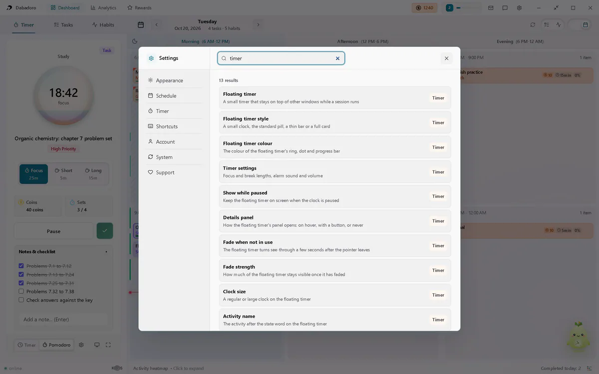
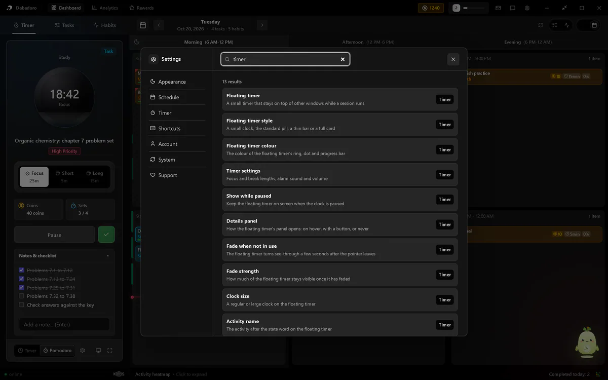
In this picture
- Search settingsType a name or a word it relates to.
- A resultIts label and what it changes. Choose it to open it.
- Its tabWhere the setting lives.
Esc clears the search, and a second press closes Settings. Point at the info icon beside a label for a short hint. Some hints draw a small picture of the setting.
Appearance
The theme, the clock widget on the dashboard, the undo message, zoom and the keyboard focus outline.
Theme
How Dabadoro looks. The floating timer follows it.
- Default
- Dark
- Range
- Dark or Light
- Where
- Settings > Appearance
Widget style
Daba or a plain clock face in the dashboard corner.
- Default
- Daba mascot
- Range
- Daba mascot or Minimal analog
- Where
- Settings > Appearance, Clock widget
Show clock widget
Shows the mascot or clock on your dashboard. Click it to open the AI Command Centre.
- Default
- On
- Where
- Settings > Appearance, Clock widget
Show in fullscreen
Keeps the widget on screen in both fullscreen views.
- Default
- Off
- Where
- Settings > Appearance, Clock widget
Widget size
Makes the mascot or clock larger.
- Default
- 100%
- Range
- 100% to 200%
- Where
- Settings > Appearance, Clock widget
Show undo message
A short message with an Undo button after each change. CtrlZCmdZ works either way.
- Default
- On
- Where
- Settings > Appearance, Messages
Zoom
Makes everything in the app larger or smaller. Also Ctrl=Cmd= and Ctrl-Cmd-.
- Default
- 100%
- Range
- 28% to 200%
- Where
- Settings > Appearance, Accessibility
Show keyboard focus outline
Draws a ring around the control you reach with Tab.
- Default
- Off
- Where
- Settings > Appearance, Accessibility
- Since
- 1.2
Schedule
New in 1.2. How the day is laid out, what the schedule draws, and the dashboard layout.
Schedule view
Columns that fit your window, one list, or one period. See schedule views.
- Default
- Period columns
- Range
- Period columns, One-day list or One period at a time
- Where
- Settings > Schedule
- Since
- 1.2
Minimum column width
Fewer columns show once one would be narrower than this.
- Default
- A fifth of your screen's width
- Range
- Or your own, 200 to 800 px in steps of 20
- Where
- Settings > Schedule, Column width
- Since
- 1.2
Show current time line
A red line marks the current time on your schedule.
- Default
- On
- Where
- Settings > Schedule, Display
Fold empty hours
Hides runs of two or more free hours in the one-day list.
- Default
- Off
- Where
- Settings > Schedule, Display
- Since
- 1.2
Show a week strip
Seven days above the schedule. The calendar button turns it on too.
- Default
- Off
- Where
- Settings > Schedule, Display
- Since
- 1.2
Show tracked time
A green line beside the hours marks the time you tracked.
- Default
- On
- Where
- Settings > Schedule, Display
- Since
- 1.2
Dashboard layout
One tab bar on the left, or the timer, schedule and lists side by side. Side panels resize from 260 to 560 px.
- Default
- Classic
- Range
- Classic or Timer, Schedule, Tasks and Habits
- Where
- Settings > Schedule
- Since
- 1.2
| Button | What it does |
|---|---|
| Reset to defaults | Puts every choice on this tab and both panel widths back to how they started. |
Timer
The floating timer's look and behaviour, and the way into the focus timer settings. Every setting on this tab is new in 1.2.
Floating timer style
From a small clock to a full card. Try them on the floating timer page.
- Default
- Standard
- Range
- Minimal, Standard, Bar or Detailed
- Where
- Settings > Timer, beside the preview
Show the floating timer
On top of other windows while a session runs in the background. It carries the Pro mark: it is a Pro feature, open to everyone while plans are not on sale.- Default
- On
- Where
- Settings > Timer, Behaviour
Show while paused
Keeps the floating timer on screen when the clock is paused.
- Default
- On
- Where
- Settings > Timer, Behaviour
Details
How the floating timer's panel opens: on hover, with a button, or never.
- Default
- Hover
- Range
- Hover, Button or Never
- Where
- Settings > Timer, Behaviour
Fade when not in use
Turns see-through 4 seconds after the pointer leaves.
- Default
- Off
- Where
- Settings > Timer, Behaviour
Fade strength
How much of the timer stays visible once faded.
- Default
- 55%
- Range
- 20% to 80%, in steps of 5
- Where
- Settings > Timer, Behaviour
Colour
The ring, dot and progress line. Breaks keep their own colours.
- Default
- Theme accent
- Range
- Theme accent, Task colour, Habit colour, Reward colour, Done colour or Alert colour
- Where
- Settings > Timer, Look
Clock size
A regular or large clock. Minimal always uses the regular one.
- Default
- Regular
- Range
- Regular or Large
- Where
- Settings > Timer, Look
Activity name
The task or habit after the state word on the floating timer.
- Default
- On
- Where
- Settings > Timer, Look
Progress ring
The ring that fills as the set goes by.
- Default
- On
- Where
- Settings > Timer, Look
| Button | What it does |
|---|---|
| Timer settings: Open | Opens the focus timer settings: 25, 5 and 15 minute defaults, the alarm sound and its volume. Session durations (min) and Maximum (min) are in minutes. Progressive focus and Cycle carry the Pro mark. See the focus timer guide. |
Note
Shortcuts
Every keyboard shortcut, and whether its key shows next to its button.
Keyboard shortcuts
Press a key in a field to change it. Every default is on the keyboard shortcuts page.
- Default
- 15 shortcuts
- Range
- Any key, with Ctrl, Shift or Alt. The zoom keys are reserved.
- Where
- Settings > Shortcuts
Shortcut hints
Shows or hides the key next to a button in the app.
- Default
- Shown for 11 of 15
- Range
- Shown or hidden, per shortcut
- Where
- Settings > Shortcuts
Account
Your profile, your plan, your organisation and the data in it. Log out and Reset account data sit together under Log out and reset, at the end of the tab.
| Part | What it does |
|---|---|
| Profile card | Your name, username, level and XP bar, completed focus, top habit streak and total XP. |
| Manage account | Opens your account page in the browser: name, email, password and security. |
| Plan | Your plan and what it includes. Until paid plans go on sale, the free plan lists what Pro includes, with no button, and says Pro and Max are coming soon. Once they are on sale, it offers Team and Education plans and Upgrade, which open the website. A paid plan shows its status, such as when it renews, and the Ads off or Ads on chip, which opens Show ads on the Support tab. For a plan paid through Paddle, Manage plan opens Paddle's billing portal in your browser: update your card, download invoices or cancel. |
| Organisation | Join an organisation takes the code your team or school gave you. The organisation's owner then sees your display name and username. A member sees the organisation's plan and can Leave it, losing the plan it gives. The owner holds one of the seats and cannot leave. They see how many seats are used, make an invite code with Make a new code, and see the members, each with Remove. To add seats, write to contact@dabadoro.com. |
| Log out | Logs out of the app and your browser. If the server refused some changes, it asks first: Keep them on this device or Delete them and log out. |
| Reset account data | Clears tasks, habits and history from your account. It needs a connection. |
Watch out
Reset account data cannot be undone. Your account stays; its contents go.
System
Sync problems, updates, the release notes and the first-run guide.
| Part | What it does |
|---|---|
| Sync | Shows only when the server refused a change. Each row offers Try again or Use the cloud copy. See sync and accounts. |
| Updates | Your version, such as Dabadoro 1.2.1, and a button that checks for a newer one and installs it. |
| Get early updates | Under Updates, while you are signed in. On Pro and Max, a switch, off by default: new versions before everyone else, sometimes with rough edges. On the free plan, the Pro mark and Upgrade. Until paid plans go on sale, it says Coming with Pro and Max. |
| What's new | Changes in each update, newest first. The same list is on the changelog. |
| Guide | Five short steps to your first coins. Show the guide again runs them from the start. See your first five minutes. |
Support
Ads on your plan, ways to support the app and the legal pages.
| Part | What it does |
|---|---|
| Remove ads | Shows on the free plan. Once paid plans are on sale, See Pro plans opens the plans page in your browser. Until then, it says Coming with Pro and Max. |
Show ads
On Pro, Max, Team and Education, in place of Remove ads. Off by default on your plan. Turn it on to see ads and support Dabadoro. An ad you close then stays hidden on all your computers. The Ads on or Ads off chip on the plan card, on the Account tab, opens it.
- Default
- Off
- Where
- Settings > Support
- Since
- 1.2
| Part | What it does |
|---|---|
| Coming soon | The merch store's button. Until a new merch store opens, it reads Coming soon and opens nothing. Dabadoro is made by one developer, and the store will be a way to support it. On the free plan, or with Show ads on, an ad can show below it. |
| Privacy Policy | Opens the privacy policy in your browser. |
| Terms of Service | Opens the terms of service in your browser. |
| End-User License Agreement | Opens the licence for the app in your browser. |